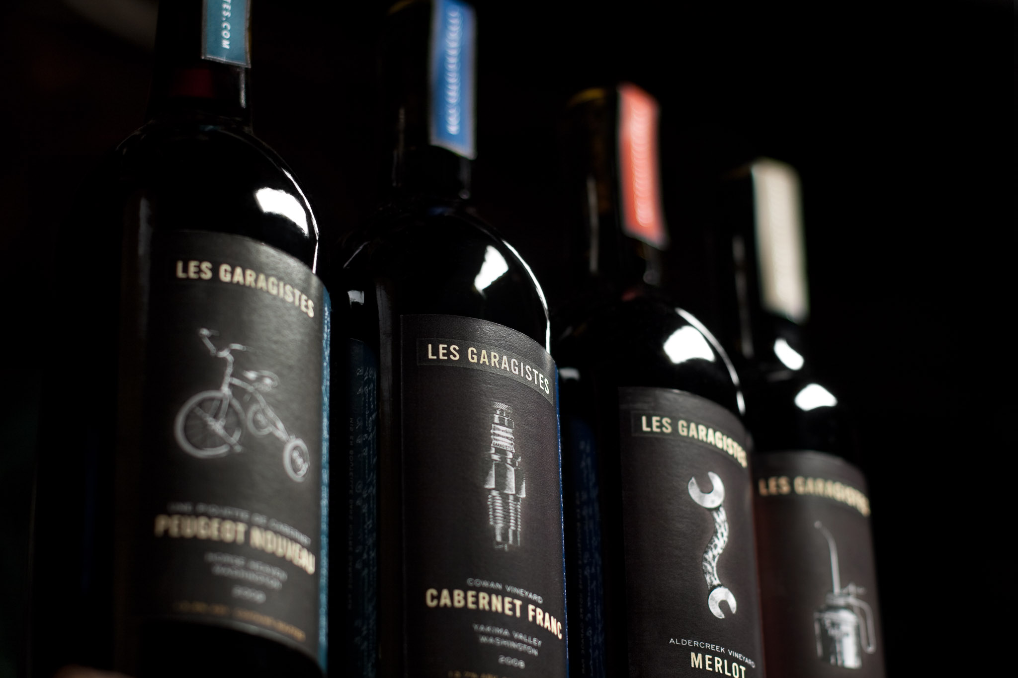
Okay, full disclosure: this is a project where the client is me. Or to be more precise, me and about 30 other people in the cooperative I run. Talk about tough clients!
Still, it was a great opportunity to take my decades of design and packaging experience and focus it on something I love: making wine. So I treated this client as a real client, starting with a brand articulation and then executing it through a rigorous visual strategy.
“Les Garagistes” evokes the winemakers who, when faced with the stratospheric cost of land in their native Bordeaux, took the radical step of simply buying fruit and fermenting it in their own humble garages. While we don’t live anywhere near France, we share that kind of practical, down-to-earth philosophy. It’s about the wine, not the trappings. So as long as you start with the best fruit you can find, and pay attention to every stage of its evolution from juice to finished wine, you can do it anywhere. Even in a garage.
So why not start with a French garage as the visual strategy? I’ve been a little loose about how I applied it – this is wine, not a legal document – but my idea was that every varietal would have as its visual brand something you might find in a French garage. Or at least a European garage. Or heck, any garage.
I’m proud this packaging earned a shout out in Communication Arts. And that when we entered six of our wines in the Oregon State Fair in 2015, all of them earned silver except for one, which earned gold – that’s all about the packaging, isn’t it?

