• Portland’s Transportation System Plan

    Brand/Creative Strategy, Creative, Video

    The Transportation System Plan is Portland's ambitious roadmap for the next 20 years, charting a course toward what the city should focus on and invest in to accommodate the quarter-million new residents expected to move here. It's a visionary document with a girth to match: 350 exhaustively researched and highly detailed pages. My task was to distill it into a 7-minute introduction ..[There’s more]

  • Through the Gates

    Creative

    Eve was an acquaintance I knew through social media when I started noticing her posts from a trip through Vietnam. The writing — short vignettes somewhere between poetry and prose – was so incredible I contacted her when she got back: let’s make a book together...[There’s more]

  • Oregon Flora

    Brand/Creative Strategy, Creative, User Experience (UX) + Design (UI)

    Oregon Flora is an incredible repository of information on more than 4700 vascular plants across the state. I completely overhauled the site to clearly communicate its value, relevance and importance, redesigned the UI of its tools to make them more intuitive to both experts and a plant-loving public, and overall, made this complex dataset more accessible – even fun... [There’s more]

  • Nick Fish for Portland

    Brand/Creative Strategy, Creative

    I consulted on two ultimately victorious political campaigns this spring, contributing foundational messaging strategy to both. Closest to home was Portland City Councilor Nick Fish’s bid for re-election against a tough, insurgent challenger.
    The result? A resounding 61.8% of the vote in the primary, well past the 50% threshold that would have forced a runoff in November. Now, instead of running for office this summer and fall, Nick can devote all his considerable energy to the important work he does for all Portlanders on City Council... [There’s more]

  • plasq.com

    Brand/Creative Strategy, Creative, User Experience (UX) + Design (UI)

    After creating the UX and UI for Comic Touch, plasq's spiffy comic book cover creation app, I had a pretty good idea about who the company was and what it stood for. So when they asked me to revitalize and refocus the company's website, I knew immediately what it should say: fun. Like a comic book, but with scroll bars.
    Working with plasq's onsite developer, I created a bright, sunny and light-hearted UI, steeped in the visual language of classic comic books... [There’s more]

  • Montessori Public

    Creative

    You may not know this about me, but a long time ago, I ran an alternative paper here in Portland. We called it "The Free Agent," and in addition to editing the rag, it was my first large-scale design project. I remember the warm, round smell of hot wax (used to stick columns of text to boards), the din of newsprint speeding through the rollers, the satisfaction of turning the pages in my hand after I grabbed one, literally hot off the press.
    So you can imagine how excited I was when the National Center for Montessori in the Public Sector asked me to help them revive the newspaper it sends to its teachers and schools around the country. It was like getting back on a bicycle after a long hiatus, only now I had 25 years of experience to leverage as I hopped on ... [There’s more]

  • Outdoor School for All

    Brand/Creative Strategy, Creative

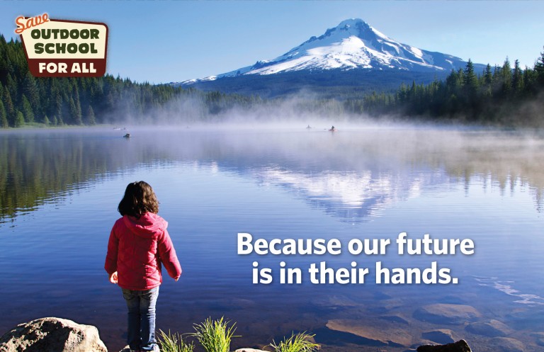
    [UPDATE 11.08.16: The Outdoor School for All initiative passes overwhelmingly!]
    Since its first band of Medford sixth graders in 1957, Outdoor School’s mission has been simple: get our next generation of leaders off the couch and out into Oregon’s great outdoors. It's a uniquely Oregon tradition, and one that reflects the heart and soul of what it means to live here. The problem is that because of increasingly tight school budgets, currently only about half of Oregon’s students get to experience Outdoor School.
    The braintrust behind this worthy initiative asked me to help articulate exactly why it's in every Oregonian's interest to bring this to life. From a creative brief I developed pinpointing the advantages and opportunities of Outdoor School, I created branding, an introductory pitch brochure, and a leave-behind addressing funding head-on.

  • Growing Gardens

    Brand/Creative Strategy, Creative, Photography

    Simply put, Growing Gardens teaches people how to grow their own food in their own back yards. And that's part of why I love it, and have been donating my time to it since 2011: the simplicity of the concept. With the simple act of growing your own food, you get healthier people, a healthier planet, and healthier communities. That's a lot of bang for your buck.
    I started donating design and production of their annual reports but quickly expanding my role into communications and brand strategy, focusing and refining how they talk about what they do and why it matters. That effort culminated in this "seed packet" I wrote and designed...

  • The BTA Alice Awards

    Brand/Creative Strategy, Creative, Photography

    It's been an honor to support the Bicycle Transportation Alliance with strategy and creative for its signature fundraising event – the Alice Awards + Auction – since its very first edition. But this year was different: after more than 25 years, the organization was changing its name and expanding its mission beyond bicycling to walking and transit.
    So, really, the BTA turned to me with two projects in one: not only branding strategy and creative for the event, but for the new organization, too.

  • Les Garagistes Winery

    Brand/Creative Strategy, Creative, Photography

    Okay, full disclosure: this is a project where the client is me. Or to be more precise, me and about 30 other people in the cooperative I run. Talk about a tough client!
    Still, it was a great opportunity to take my decades of design and packaging experience and focus it on something I love: making wine. So I treated this client as a real client, starting with a brand articulation and then executing it through a rigorous visual strategy – one ultimately featured in Communication Arts ...

  • Health in Harmony: Annual Appeal

    Creative

    This is our sixth collaboration with Health in Harmony on its annual appeal. This year, the message was momentum and building on it. Our visual strategy was to balance a clean, modern composition (mirroring the top notch healthcare the organization provides) with the faces and textures of the population they serve. Too many families in the developing world face a tragic Catch-22: the only way to put food on the table today is to log and destroy the same forest they'll depend on tomorrow. Almost literally, they must saw off the same limb they're standing on. But faced with the tragic choice of saving their children or saving their forests, they have no alternative...