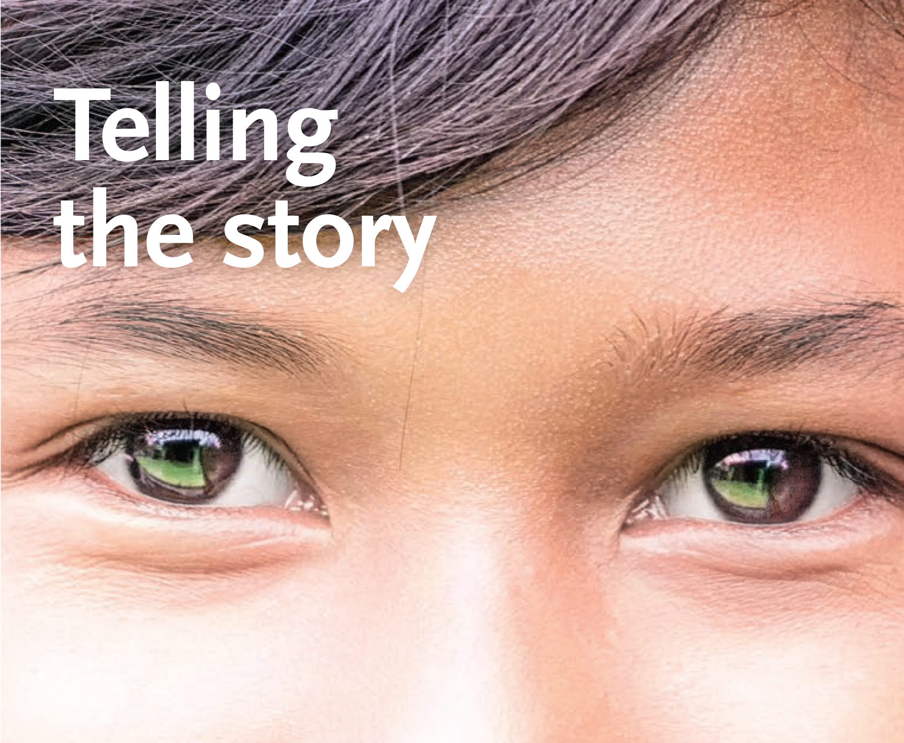
This is our sixth collaboration with Health in Harmony on its annual appeal.
Too many families in the developing world face a tragic Catch-22: the only way to put food on the table today is to log and destroy the same forest they’ll depend on tomorrow. Almost literally, they must saw off the same limb they’re standing on. But faced with the tragic choice of saving their children or saving their forests, they have no alternative.
The genius of Health in Harmony is to short-circuit that spiraling cycle: in exchange for responsible stewardship of the rainforests, families get high-quality, low-cost healthcare. As we put it in our brand strategy, Health in Harmony saves rainforests with a stethoscope. It’s a brilliantly simple model that the organization hopes to replicate around the planet, and they have momentum: this year marked the groundbreaking of a brand new health clinic.
This year, the message was that momentum and building on it. Our visual strategy was to balance a clean, modern composition (mirroring the top notch healthcare the organization provides) with the faces and textures of the population they serve.

