User experience and user interface isn’t just about the visuals. It’s designing what those visuals say and what they help you and your audience accomplish.
-
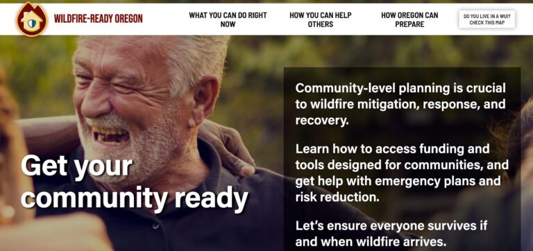
It's sadly true: wildfires are now a fact of life in Oregon. And because more and more people live in or next to "wildland urban interfaces", more and more people will have to face them or their consequences every year. That's the driving force behind Wildfire-Ready Oregon, a project of 1000 Friends of Oregon to help all Oregonians make sure they're ready and resilient in the face of a more flammable planet ...[There’s more]
-
Access Tech
Access Tech is an approachable, seasoned group of IT professionals who needed to stand out in a field crowded with big players and a lot of buzzwords. SD-WAN SECaaS, anyone?
So I recommended they make a virtue of their size ...[There’s more] -
Oregon Flora
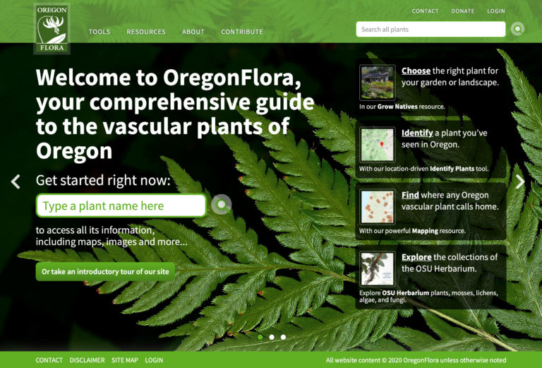
Oregon Flora is an incredible repository of information on more than 4700 vascular plants across the state. I completely overhauled the site to clearly communicate its value, relevance and importance, redesigned the UI of its tools to make them more intuitive to both experts and a plant-loving public, and overall, made this complex dataset more accessible – even fun... [There’s more] -
plasq.com
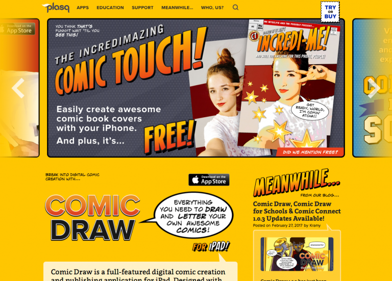
After creating the UX and UI for Comic Touch, plasq's spiffy comic book cover creation app, I had a pretty good idea about who the company was and what it stood for. So when they asked me to revitalize and refocus the company's website, I knew immediately what it should say: fun. Like a comic book, but with scroll bars.Working with plasq's onsite developer, I created a bright, sunny and light-hearted UI, steeped in the visual language of classic comic books... [There’s more] -
Lori Mason Design
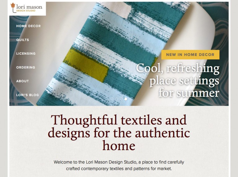
Lori Mason is a skilled textile designer with an incredible eye for pattern and detail, and was looking to take her business to the next level. We helped her articulate what exactly that meant for her, and then created a web presence to take her there.
-
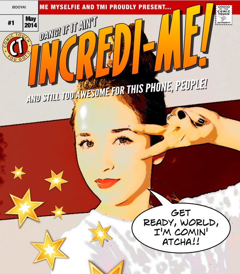
Comic Touch UX/UI
User experience, user interface, brand strategy, and 64 cover templates for Comic Touch, an app from Plasq that puts "your life on a comic book cover!" Just point your camera at the funny near you. Swipe left and right to choose a cover design overlay that fits your situation, add witty repartee and graphics, texturize your look, and then share it with the world!
-
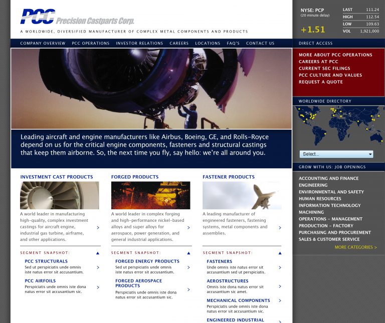
Precision Castparts
We successfully designed and developed the first corporate home site for this multinational company in 2001, so we were honored to be asked to significantly re-envision the site over the last nine months. Leveraging in-house IT staff for implementation, we specified a CMS platform and then recast the entire structure of the site to mirror PCC’s business areas and serve its key audiences. The result is lean and focused, like the company itself.
-
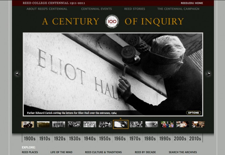
Reed College Centennial
Design, messaging strategy, art direction of archival imagery, and development of this dual-purpose site celebrating Reed’s first 100 years, and launching a $200-million fundraising effort. For Reed's Centennial, we advised on and concocted some of the major messaging, then designed the core Centennial brand, the three sites below, as well as a "case statement" for the Campaign and a host of direct mail pieces, ads, and banners.

